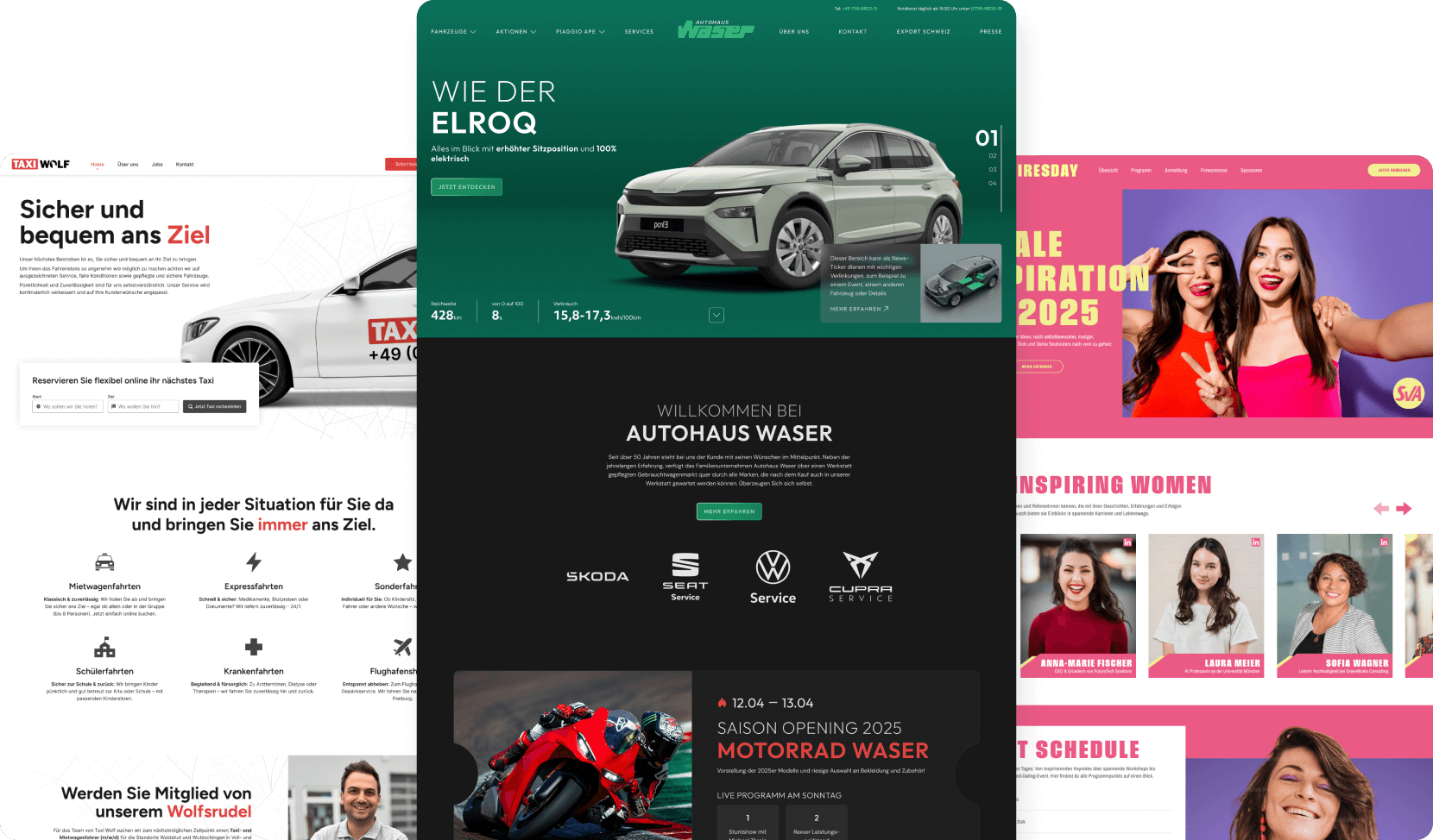
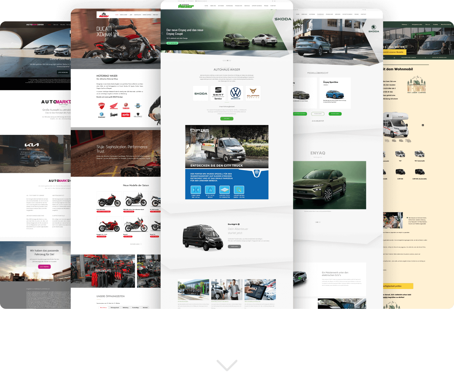
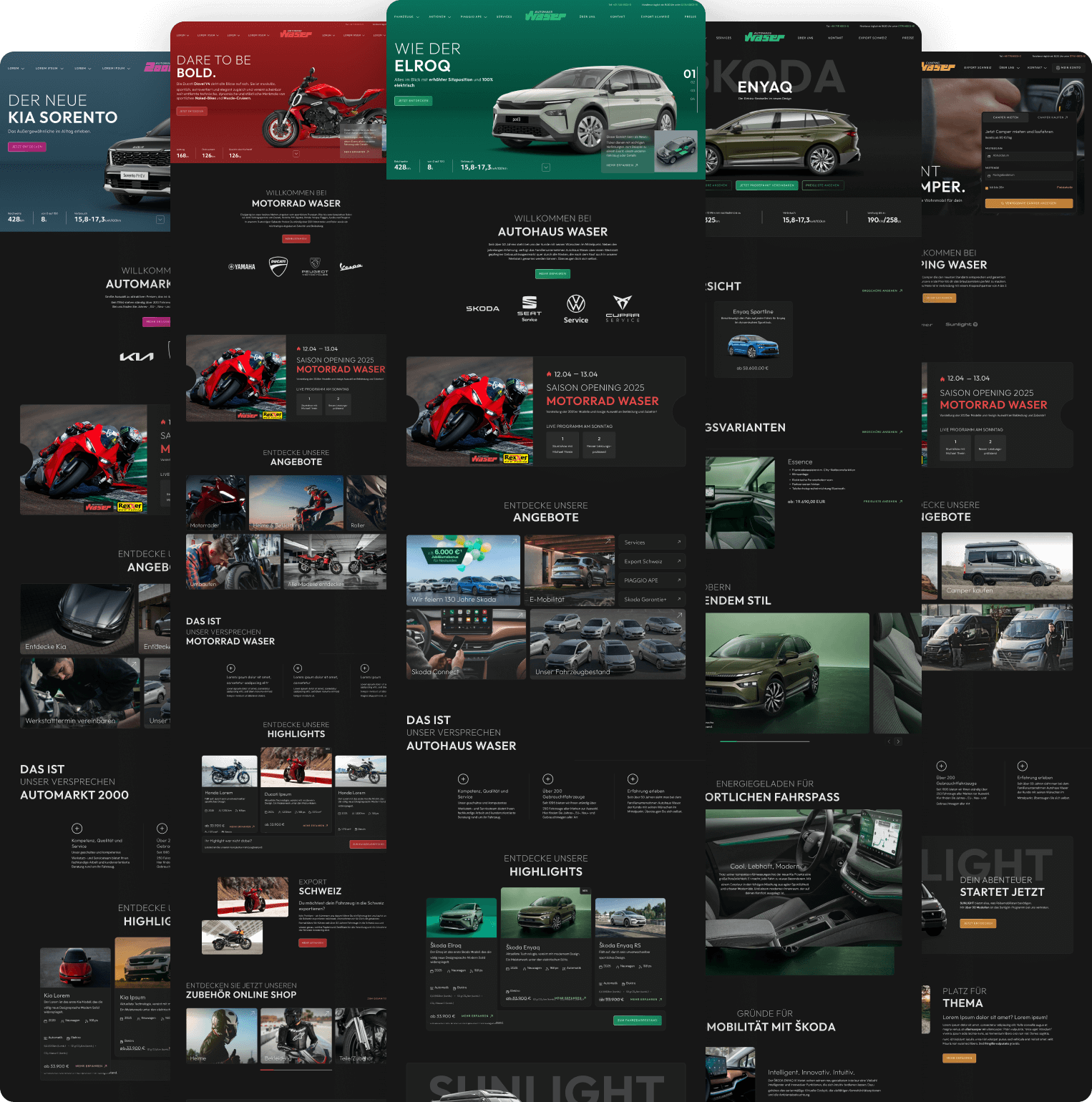
Gruppe Waser
Gruppe Waser is a multi-brand dealership group covering automotive, motorcycle, and camping businesses across four platforms. The core challenge was a fragmented digital presence that lacked clarity, cohesion, and scalability, impacting both group recognition and long-term maintainability.
As the sole designer, I led the complete UX structure, brand system, and interface logic across all platforms. From early concept and wireframing through design system development and final handoff, I owned all design decisions, grounding them in user behavior, product logic, and psychological principles rather than aesthetics alone.
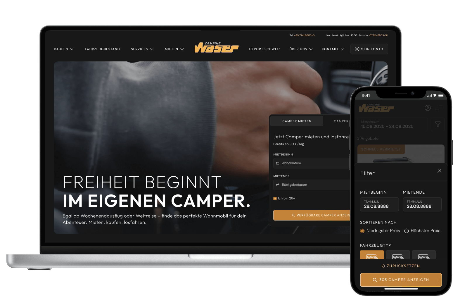
The foundation of the project was a clearly defined information architecture and page logic, developed through wireframing to smoothly guide users through different use cases, ranging from vehicle browsing to complex camper rental flows, while maintaining intuitive navigation, clear hierarchy, and logical content placement across all devices.
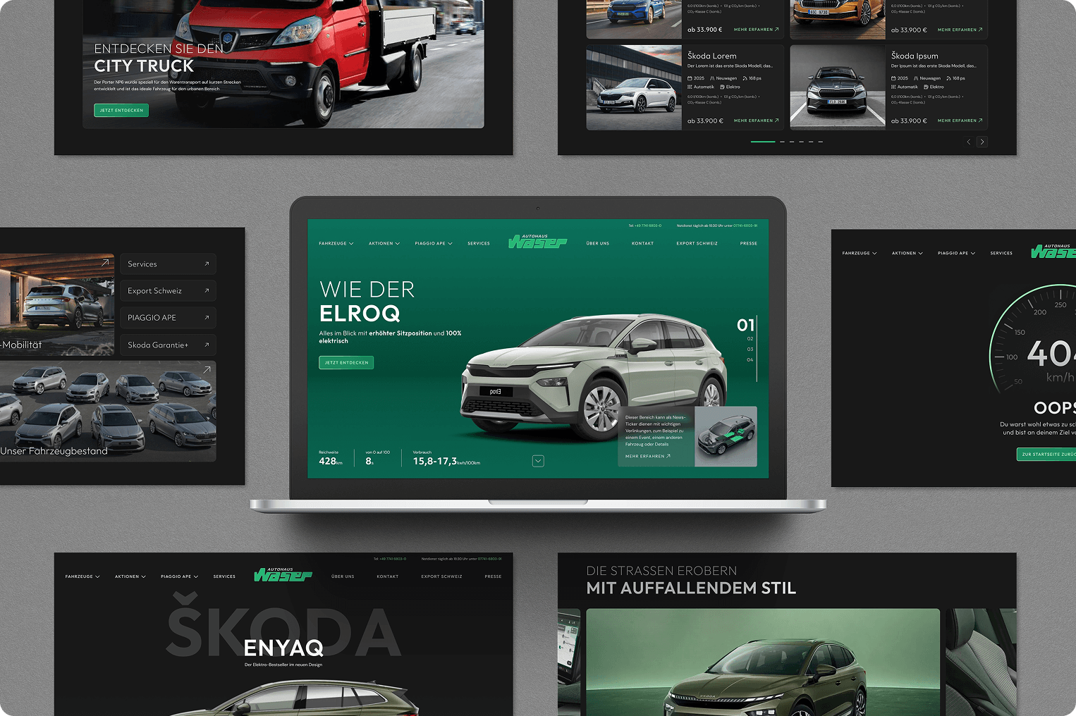
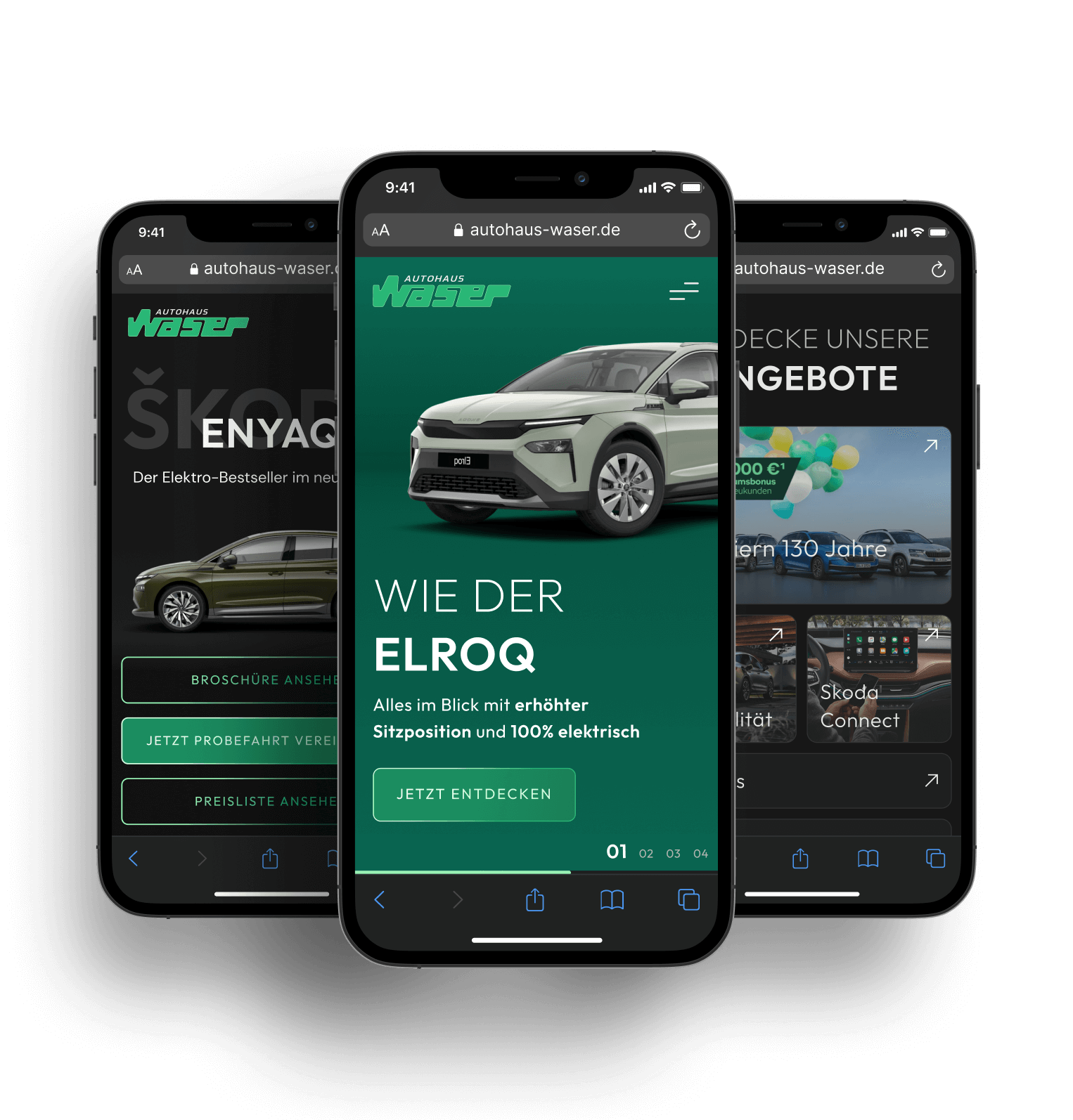
One of the main design challenges was creating components that scale across fundamentally different products and dimensions. Certain modules needed to work equally well for motorcycles, cars, and large camper vehicles without compromising layout balance, hierarchy, or perceived quality. Addressing this challenge required precise control over spacing, proportions, responsive behavior, and interaction states across all platforms.
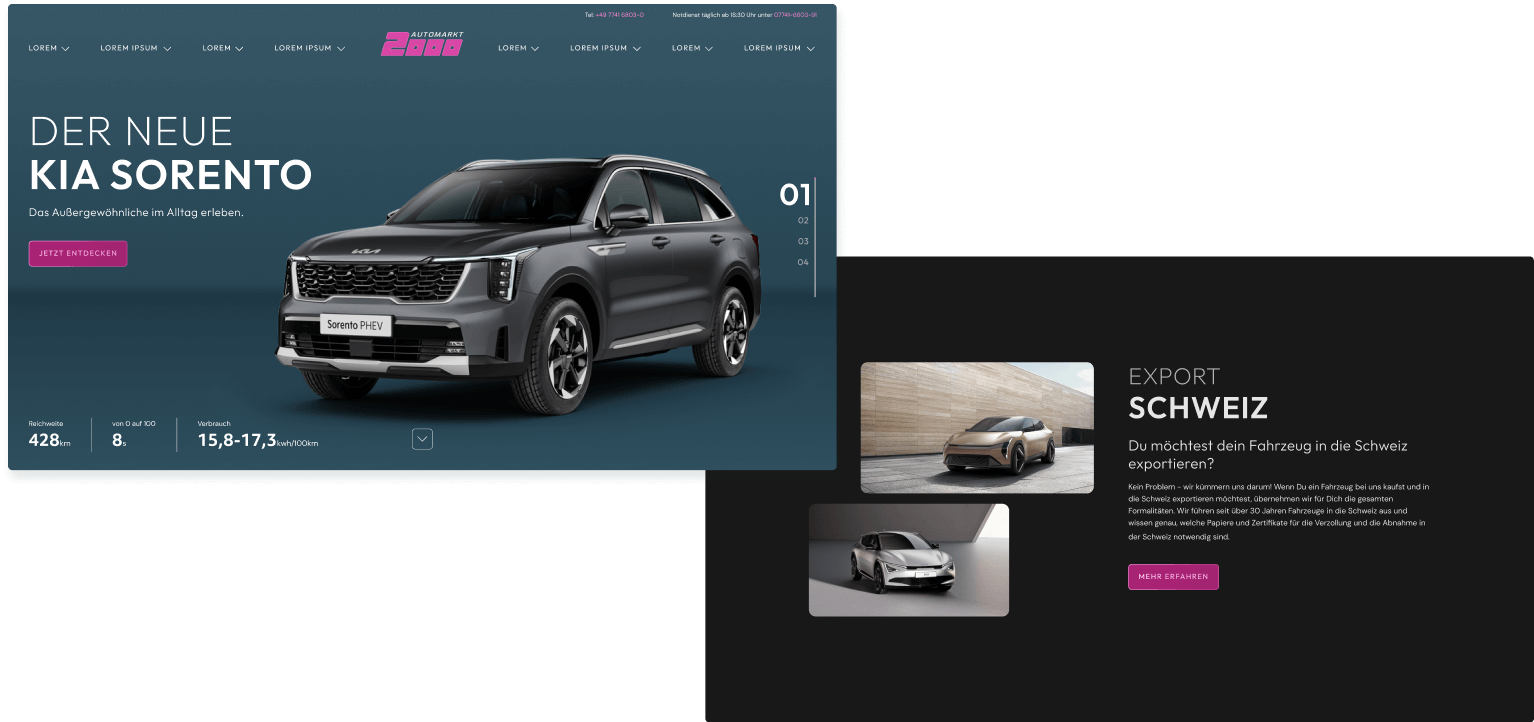
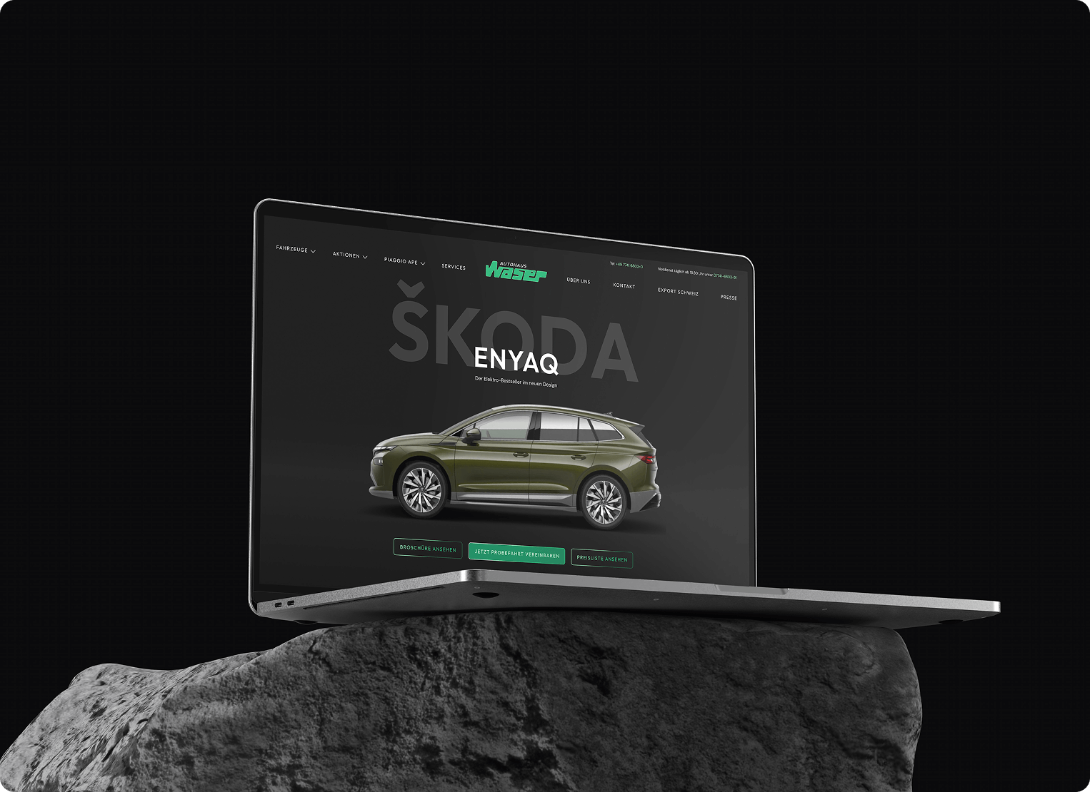
To address this, I aimed for a high-end scalable dark mode design system that feels premium yet "invisible," ensuring the interface never steals the spotlight from the vehicles themselves. As a result, it unifies all four websites into a single, recognizable Waser world. Layouts, spacing logic, typography, components, and interaction patterns are shared across the system to ensure visual consistency. In order to preserve the individuality of each brand, I carefully selected primary colors, applied consistently across UI states, accents, and key interactions. Each color was chosen to reflect the respective brand context while functioning reliably within the same contrast, accessibility, and state logic throughout the system. I designed the system modularly, allowing the client after implementation to drag and drop modules to grow the site while maintaining spacing and visual integrity.
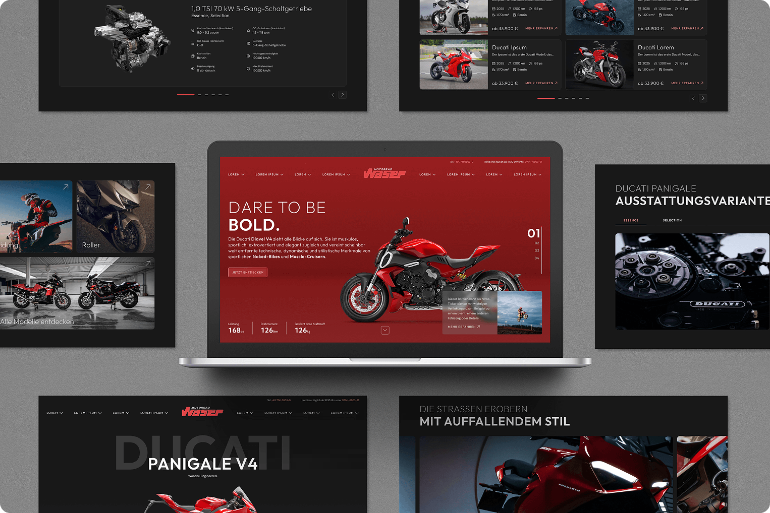
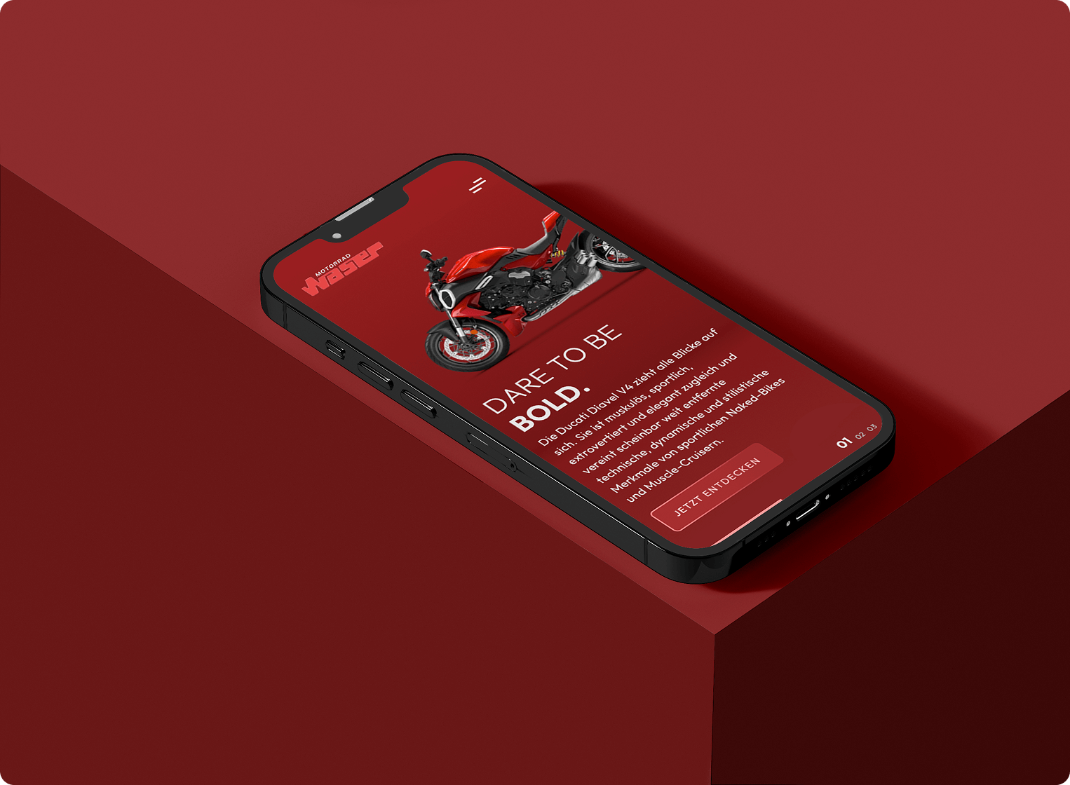
The interface was intentionally designed to feel premium, modern, and calm, ensuring the products remain the visual focus. Usability, clarity, and accessibility were prioritized across all key flows, with careful attention to interaction states, contrast ratios, focus handling, and input logic to support inclusive experiences. Micro-interactions and animations were refined down to the smallest meaningful states to ensure a high-quality experience across all devices.
Beyond UX and UI, I was responsible for a comprehensive brand realignment across the group. This included refining the existing Waser logo to improve balance and quality, developing a new logo for Automarkt 2000 aligned with the system, and renaming the camping division to strengthen group affiliation. To support this structurally, I introduced a dedicated Gruppe Waser brand layer to centralize shared content such as careers and company information, reinforcing the group identity across all touchpoints.
The result is a cohesive, future-proof digital ecosystem that improves usability across multiple platforms, strengthens brand perception, clearly positions Waser as a unified group, and provides a scalable foundation for long-term maintainability and growth.
There’s more to the story: A detailed case study is available upon request and provides deeper insight into the UX strategy, system design, and decision-making behind the final result.
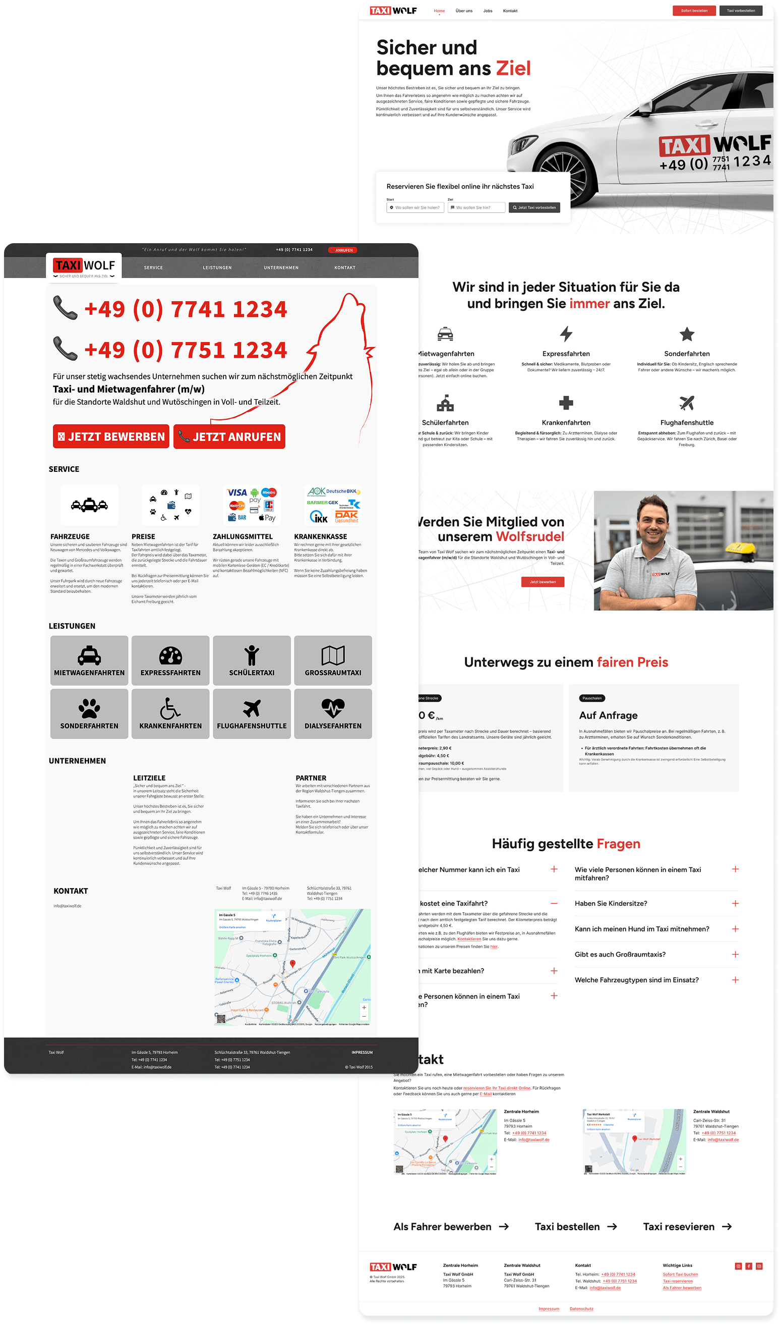
Taxi Wolf
This redesign focused on modernizing the visual appearance while significantly improving usability and conversion.
A key part of the project was the introduction of a simplified online booking flow. Instead of presenting users with a complex form upfront, I designed the interaction as a two-step process to lower the entry barrier and smoothly guide users into the booking experience. Progressive disclosure helped keep interactions lightweight and reduce cognitive load throughout the process.
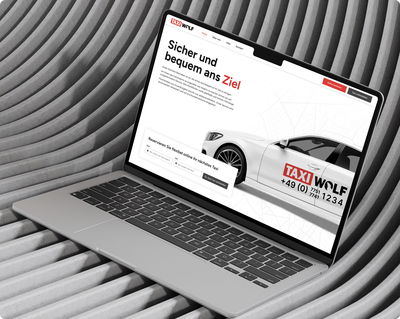
Beyond the booking experience, the website was structured to feel clear, trustworthy, and easy to navigate, with a strong focus on visual clarity and essential information.
This approach led to a noticeable increase in online bookings and user engagement, proving how thoughtful UX decisions translate into real-world results.
Before & After
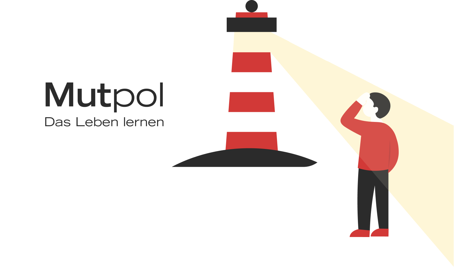
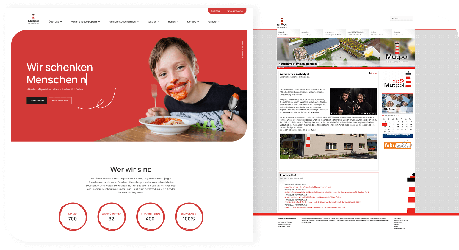
Mutpol
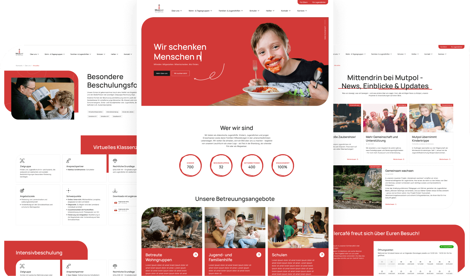
Before & After
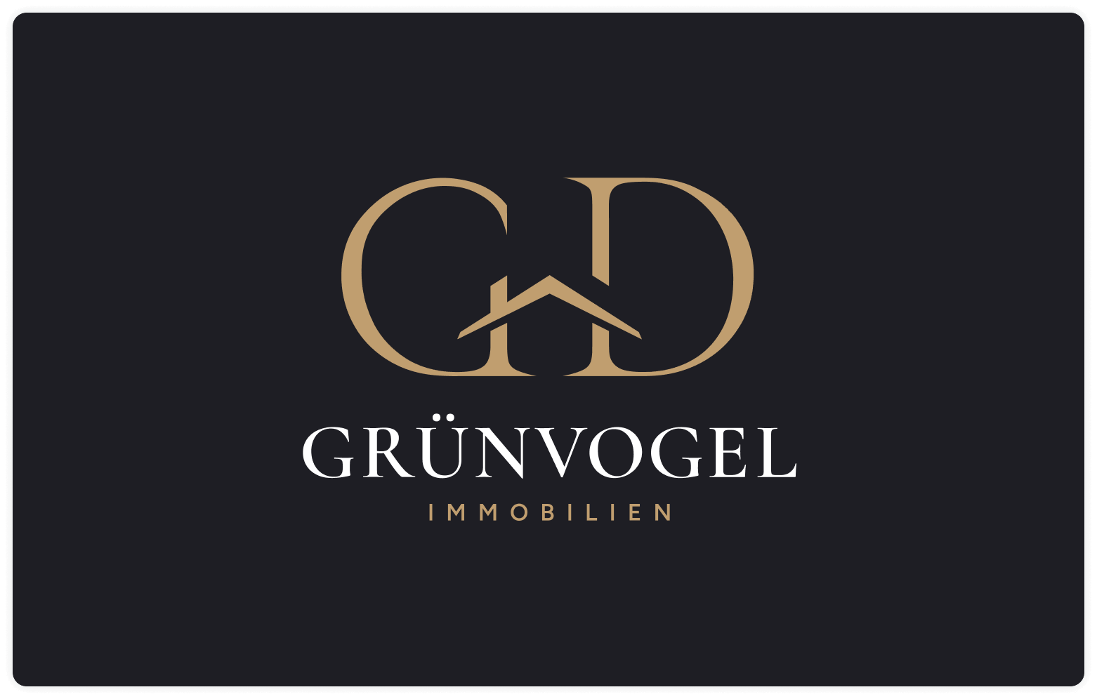
Grünvogel Immobilien / Branding
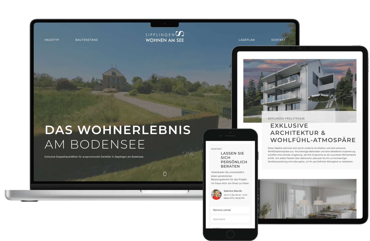
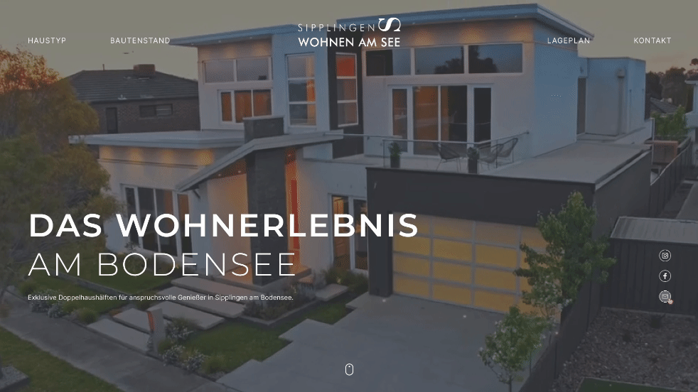
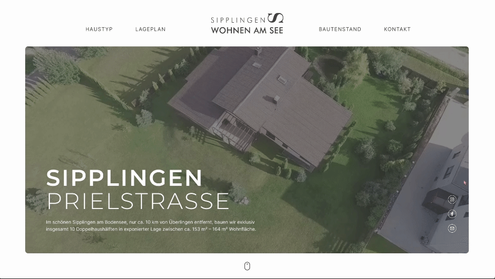
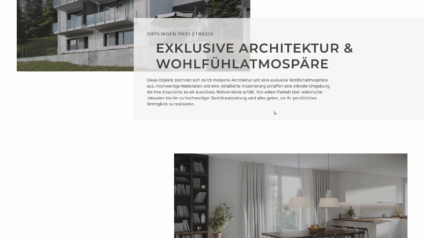
Exklusiv Wohnen Sipplingen
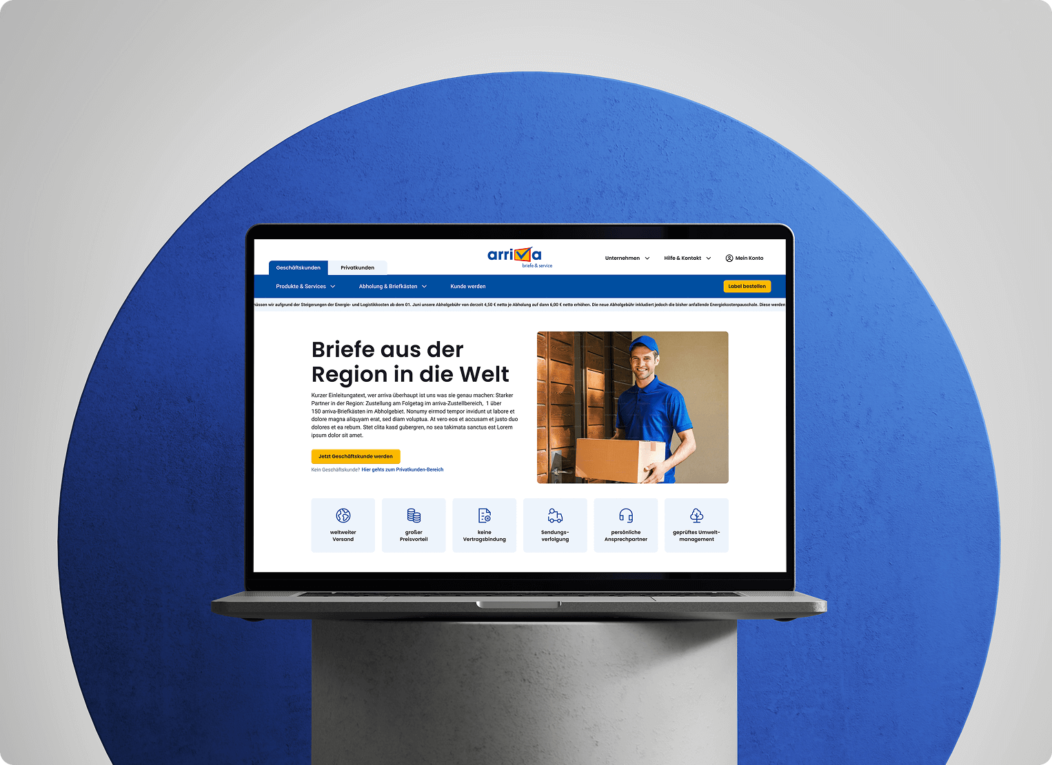
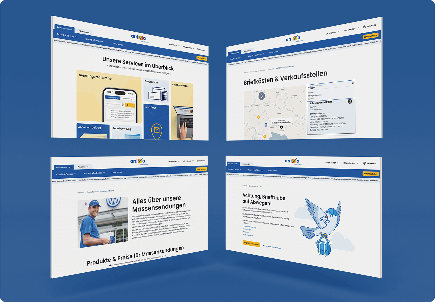
Arriva
Before & After


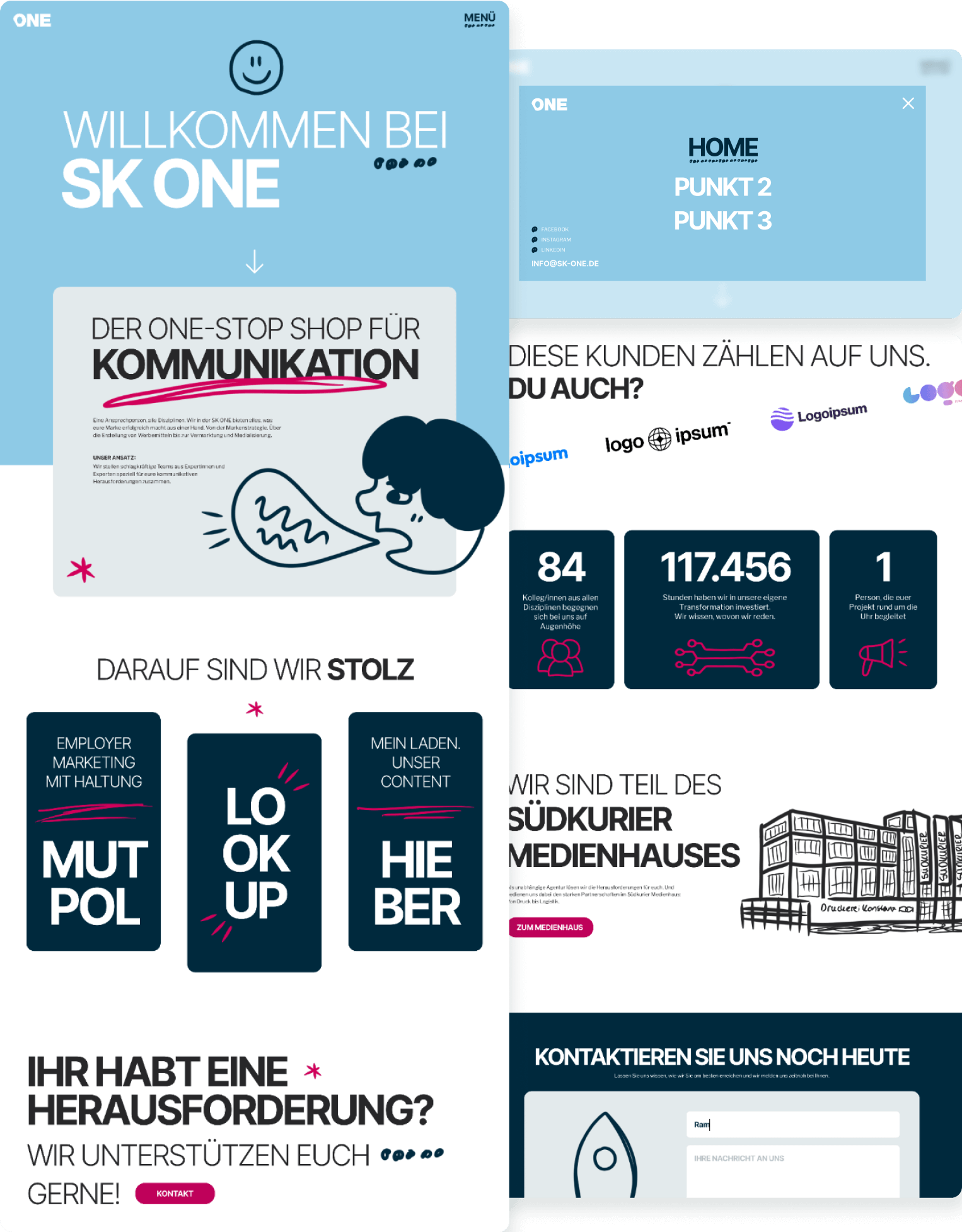
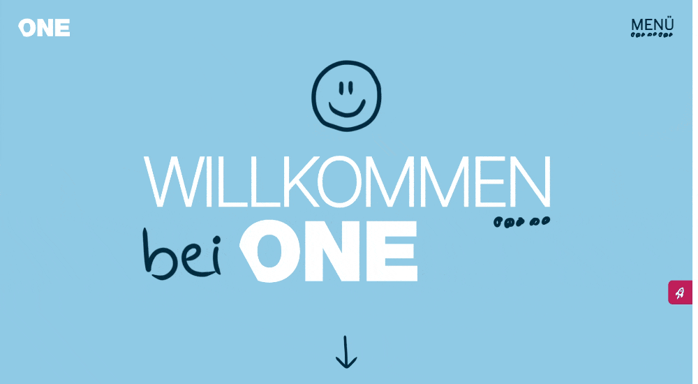
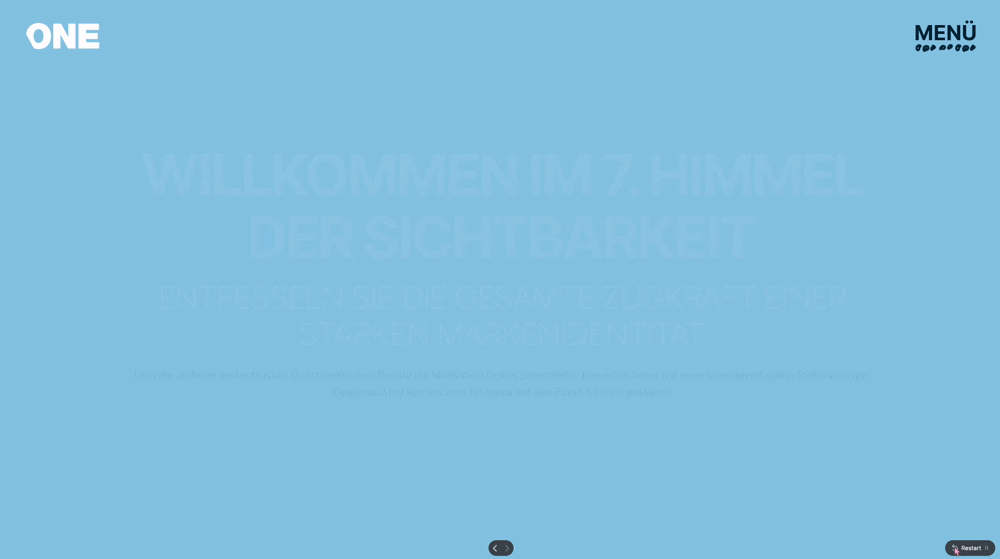
SK ONE
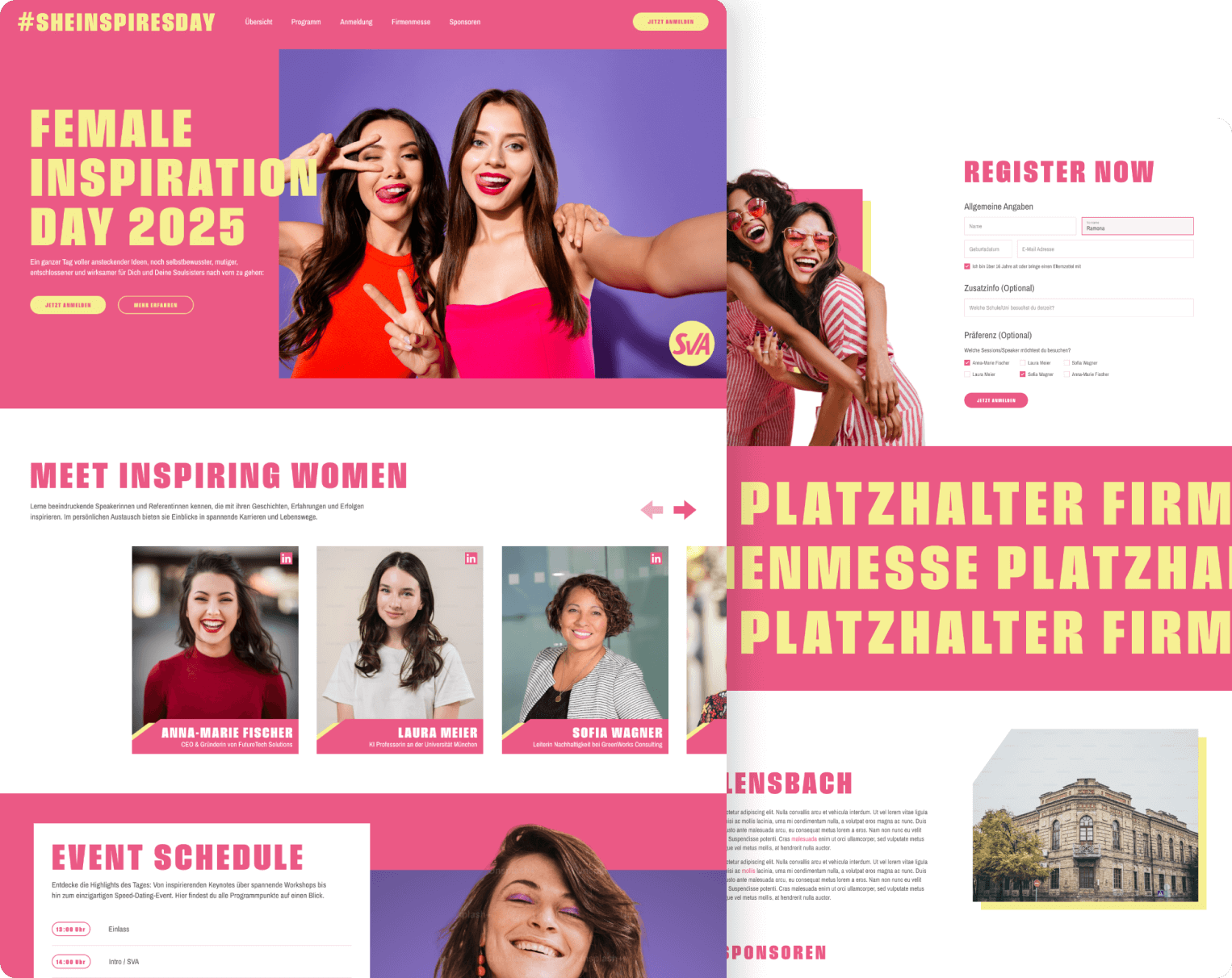
SheInspiresDay
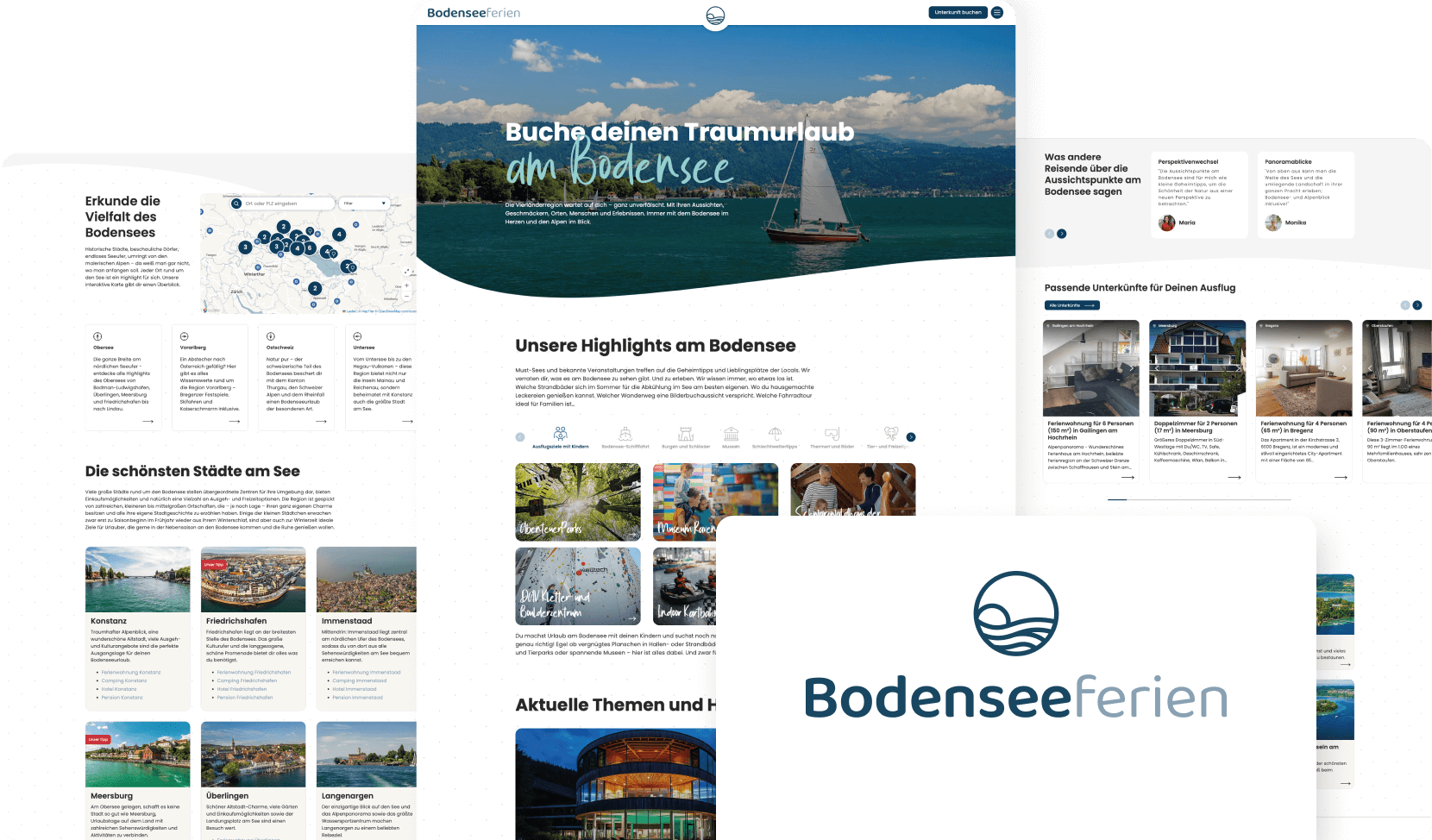
Bodenseeferien
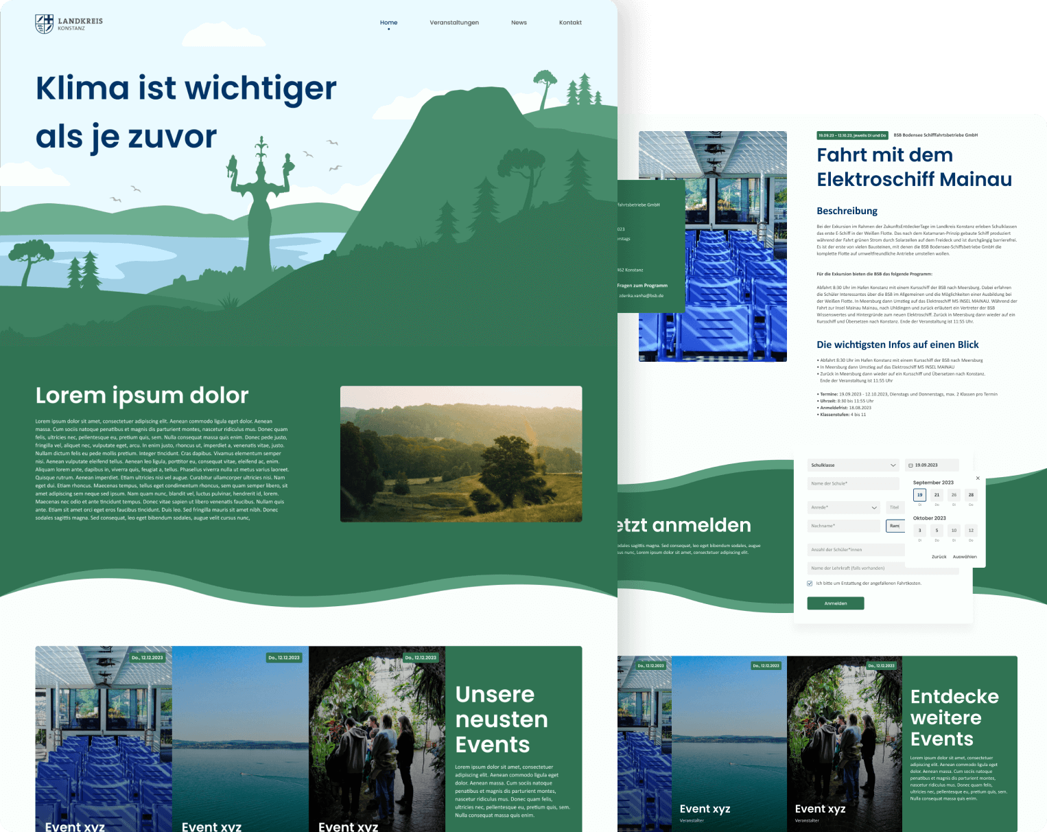
Zukunftsregion Konstanz
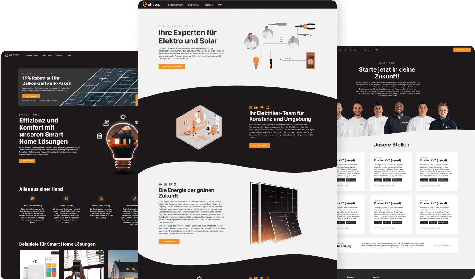
Eliotec